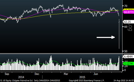
Jobless Claims
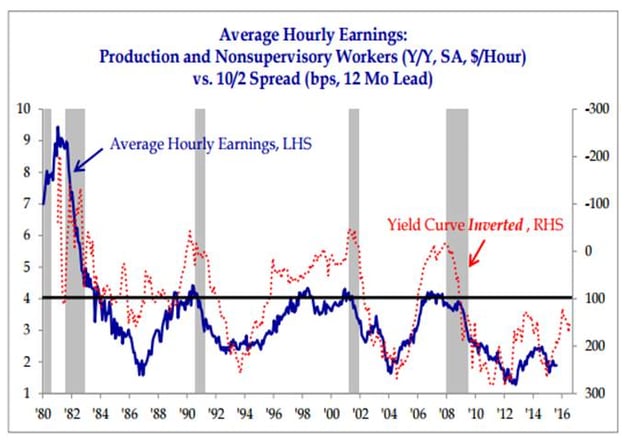
Last week’s initial jobless claims were the lowest in 42 years as shown in blue in the chart below. The reading garnered headlines on its own, but if you think about the fact that the population has grown a lot since then and look at this based on population (the white dotted line), it is clearly the lowest ever (or at least since they started calculating it in 1967). For those of you who look very closely at these charts, you will notice the population adjusted series doesn’t make it all the way to the right side of the chart…this is because the census data only goes to the end of 2014. On a related note, last night on Facebook I saw two different people who had posted something saying their companies needed workers. Could we be approaching a labor shortage and wage inflation?