S&P 500

Cash on the Sidelines
A recent survey of 191 fund managers holding $510 billion shows that last week, cash levels jumped to 5.5% of total assets. This is the highest reading since December 2008 when the world was in the midst of the financial crisis. This excess cash is another reflection of the recent fears in the market and readings like this are typically a bullish signal.
Northern Ohio Stocks
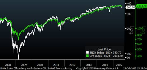
The chart below shows how Northern Ohio stocks have performed versus the S&P 500 over time. I like to look at this once in a while as a proxy for area wealth creation and as an indicator of local corporate health. The chart illuminates that fact that in 2008, Cleveland stocks experienced a sharper and deeper decline than the overall market, likely attributable to the area’s financial sector concentration (Remember National City?). From then until late 2013, local stocks did better than the overall market and interestingly over the past 18 months or so have done worse than the S&P 500. Considering that many local companies are large multi-national industrial companies, the recent relative weakness may be due to the strong dollar. In the chart below, the S&P 500 is green and the Cleveland area stocks are white. I can dig up these indices for most U.S. geographies; if you are interested in seeing another city/state, I would be happy to provide that to you.


