Muni Mayhem
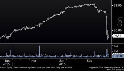
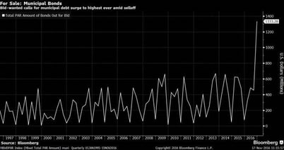
Since Donald Trump won the election last week, there have been measurable moves in several sectors and investment themes. One of the most pronounced has been the move in the municipal bond space. As the chart below illuminates, the amount of municipal debt for sale has spiked to an all-time high. Not surprisingly, municipal debt funds have dropped notably in accord with this new influx of supply. So, why is this happening? For starters, it is worth considering who is invested in municipal bonds. With the advent of ETFs and the proliferation of mutual funds, access to this space is easier than ever, so there is a new constituency of shorter-term investors in municipal bonds who are there as a result of yield chasing– similar to what I have written about related to consumer staples stocks. Additionally, with a new expectation (and tangible evidence) of higher rates going forward, municipal bonds have become less attractive to many investors. As such, investors and traders are rotating out of municipals and into areas that will benefit (or at least not get punished) by a higher rate environment. As if these two pressures were not enough, there is a third dynamic taking place. One of the things that makes municipal bonds attractive to many investors is their tax-exempt status. Investors believe that the new president will lower tax rates. If tax rates are lower, tax-free investments become less attractive. RELATED: Can the U.S. Bond Market See a Decade of Flat to Negative Returns?
Largest Municipal Bond ETF (Year-to-Date)

Stock Vs. Bond Yields
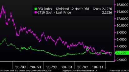
As you may have heard, the 10-Year treasury yield has now risen above the dividend yield of the S&P 500 dividend yield. It has been an unusual state for stocks to yield more than bonds, and there are some that say that this crossover is the beginning of a return to higher rates and normalcy. Below is a chart of the 10-Year U.S. Treasury yield versus the yield on the S&P 500. As you can see, Treasury yields have usually been higher than stock dividend yields: MORE: Stocks Are Losing Big Edge Over Bonds
Treasury Yields Versus Stock Yields (Since 1980)

Sector Dispersion
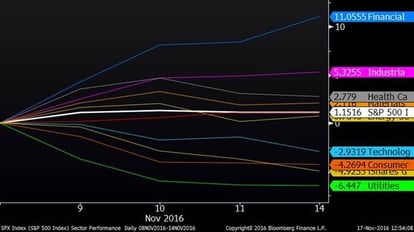
In the last blog, which came out the day after the election, I noted the remarkable dispersion between sectors. Since then, the trend has held. Financials and industrials are up strongly and income producing stocks are down measurably. The best performing sector (financials) has outperformed the worst performing sector (utilities) by 16.5% in just a week. I cannot ever remember a time when there has been such a clear bifurcation between two different themes in such a short period.
Sector Performance After Election

Housing Starts
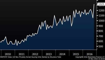
I have not touched upon this for a while, and with everything else taking place, the media has put this on the back burner, but housing starts continue to rise. In October, 1.3 million new homes were started. This marks the highest level since the recession and a continuation of the six-year uptrend.
Housing Starts (Since 2010)
