First Half Market Behavior
Despite the political drama and other fear-inducing events that have occurred this year, the stock market has been fairly strong this year. This strength, however, has not been uniform. MORE: Year to Date Market Summary Below are some charts illuminating some of the trends and dispersion within the market so far this year:
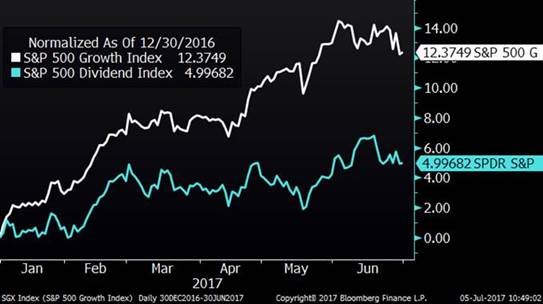
-- Dividend paying stocks have lagged this year, while growth stocks have outperformed. I believe this is due to several factors, including an increased appetite for risk, dividend heavy sectors experiencing fundamental weakness and the perception of higher interest rates on the horizon.
Dividend Payers Vs. Growth Stocks
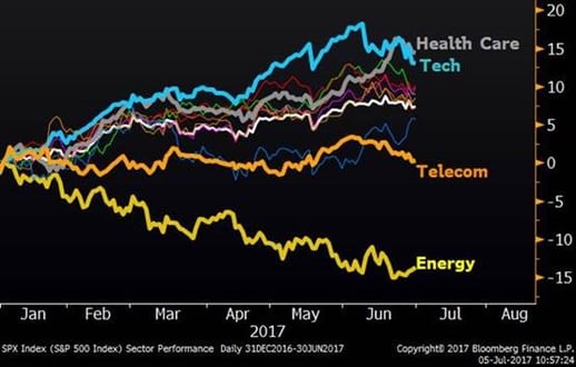
--There has been a lot of dispersion between sectors. In the chart below, you will notice that Technology and Health Care have done quite well. Meanwhile, Telecom and Energy have been weak. Telecom and Energy also tend to be more dividend intensive and conservative – income-oriented portfolios tend to have more of these stocks and fewer high-flying technology stocks.Sector Performance (YTD)
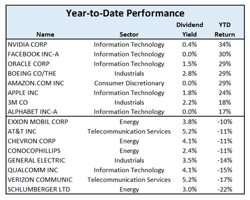
--The table below tells the same story. Looking at some of the widely held stocks and their year-to-date performance, we can see that the large tech stocks once again have led the way, along with a few industrial stocks. On the downside, clear weakness can be seen in the widely-held energy and telecom stocks, all of which are big dividend payers. All of these charts/tables point to the same conclusion – risk (or at least perceived risk) has been rewarded this year and more conservative equity portfolios have lagged.
Cellphone Disruption
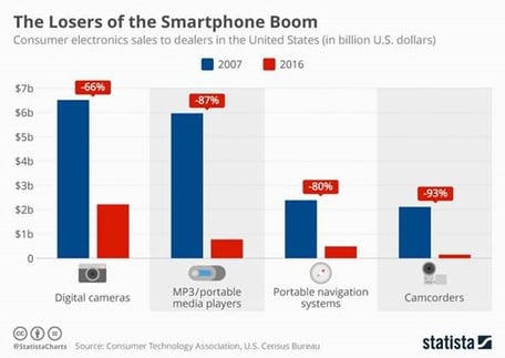
As you know, it is hard for me to resist talking about disruption in these blogs, so here is today’s disruption note. As the ten-year anniversary of the first iPhone recently passed, I happened to see these two visuals on just how much cellphones have disrupted so many industries. In the Radio Shack advertisement below (provided by Raz Pounardjian) from 1991, there is $3285.12 worth of products for sale. Today, everything in this ad can be done on your smartphone. Beyond the disruption, this also illustrates the deflationary nature of technology. MORE: iPhone at 10: How it Changed Everything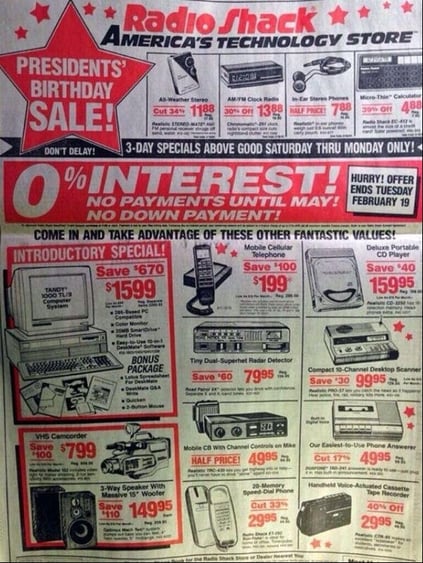
Is Solar for Real?
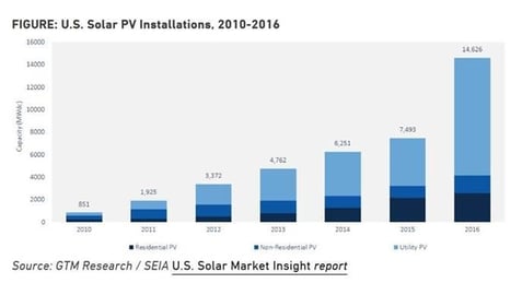
Every day, I seem to see a new story regarding a new development in solar power, a recent one being that China just finished the world’s largest floating solar farm. On top of that, when driving around, flying on a plane and even looking at random satellite images (yes, I do that sometimes), I am seeing a lot of solar power popping up. There are plenty of solar naysayers around – I receive responses from them every time I mention the word “solar” – but could solar finally be for real? MORE: Solar Grows 95% in 2016 Here is a chart on solar energy growth in the U.S.: 